How to Separate Colors for Screen Printing — With the Free Separation Studio
A complete walkthrough of spot color separation: what a separation actually is, why the white underbase is choked, what highlight white does, and how to go from artwork to press-ready film positives with our free in-browser tool.
Color separation is the step where a finished design stops being “a picture” and becomes a set of printing instructions. A screen printing press can only print one ink at a time, through one screen at a time — so somebody, somewhere, has to answer the question: which pixels of this design get which ink? That answer, one black-and-white image per ink, is the separation.
Our Spot Color Separation Studio does that job in your browser, free, with nothing uploaded anywhere. This guide walks through it screen by screen — and explains the handful of concepts (spot color, print order, underbase, choke, highlight white, film positives) that turn the output from “a pile of PNGs” into plates you can actually burn and print. If you just want the tool: use it online or download the standalone file (one .html file, works offline on any computer).
What a spot color separation is (and what it isn’t)
There are two families of color separation in screen printing, and mixing them up is the most common beginner mistake:
Spot color separation is for designs made of solid, flat colors — logos, typography, vector-style artwork, most T-shirt graphics. Each distinct color in the design becomes one ink, one screen, one plate. Six colors in the design, six plates. Every pixel is either 100% ink or 0% ink. This is what the Separation Studio does.
Simulated process separation is for photographs and gradients. It fakes continuous tone by printing a fixed set of inks (plus a white underbase) as tiny halftone dots of varying size. That’s a different technique with different tooling — and it’s why a photo run through a spot separator comes out looking like a poster: smooth gradients get snapped to their nearest flat color. That’s not the tool failing; that’s the definition of spot color. Flat artwork separates perfectly. Photographs need halftones.
Step 1 — Open the artwork, get the palette
Open your image (drag-and-drop works). The tool reads every pixel, converts it from RGB into the LAB color space, and clusters the pixels into the number of colors you set with the slider — six by default, two to twelve.
Why LAB? In RGB, two shades of “almost the same red” can be numerically far apart while looking identical, and two very different-looking colors can sit close together. LAB is built so that numerical distance ≈ visible difference, which is exactly what you want when the computer decides “these pixels are the same ink.” The clustering itself is k-means with multiple restarts — unglamorous, fast, and very good at flat-color work.
Step 2 — Assign inks, set print order
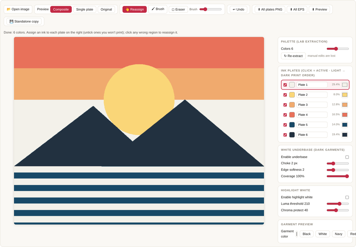
Each palette color is now a plate: one screen you’ll burn. The plate list is where you turn “colors the computer found” into “inks you actually own”:
- Rename each plate to the ink you’ll load (“Warm Red”, “Navy”) — the name is stamped onto every exported film.
- Set the ink color with the swatch picker. This matters if you’re substituting a stock ink for a color in the artwork; the preview and the plate stay honest to what you’ll print.
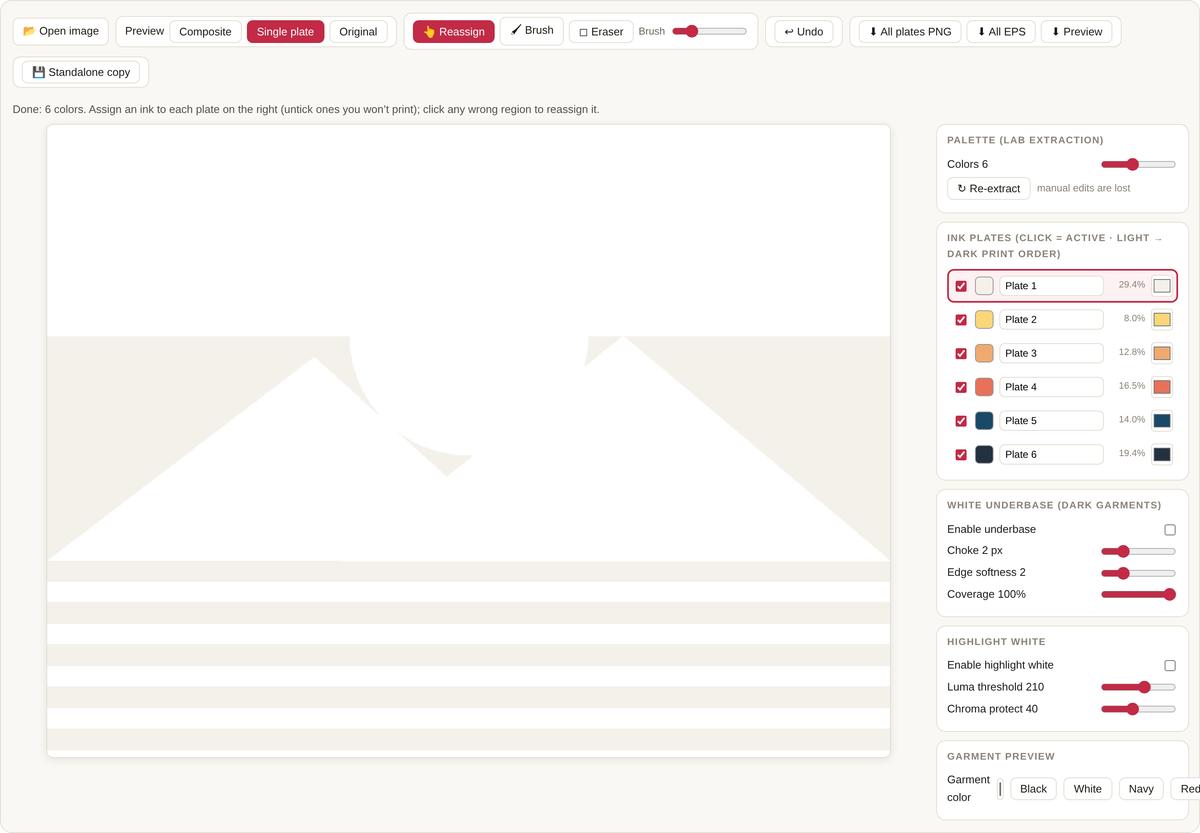
- Untick what you won’t print. The classic case is the background: if your design sits on white paper but you’re printing on a red shirt, the paper color is not an ink. Untick it and those pixels become bare garment.
The list order is the print order, sorted light → dark automatically. That’s the shop convention: light inks first, dark inks last, because a dark ink covers a light one cleanly at overlaps while the reverse shows muddy edges.
No clustering is perfect. If a region landed on the wrong plate — a shadow that joined the wrong color family — click that plate in the list to make it active, then click the region on the canvas: the whole connected region floods over to the active plate. For small strays there’s a brush and an eraser, and Ctrl/Cmd+Z undoes up to 40 steps.
Step 3 — The white underbase, and why it’s choked
Print a yellow ink straight onto a black shirt and you get a dark, greenish disappointment — plastisol and water-based inks are not fully opaque. The fix is the underbase: a plate of white ink printed first, flash-dried, with the colors printed on top. The colors then sit on white, not on black, and look like they do on paper.
Enable the underbase and the tool generates it automatically as the union of everything you’ll print — no drawing required. Two settings deserve an explanation:
Choke shrinks the underbase inward by 1–3 pixels. Without a choke, the white underbase is exactly the same shape as the colors on top, and the slightest press misregistration leaves a thin white halo peeking out at the edges. Choking makes the white slightly smaller than the colors, so the colors overhang it by a hair and the halo has nowhere to come from. This is the same “trapping” idea used throughout printing: overlapping neighbors, never abutting edges.
Coverage throttles the underbase strength. 100% is a full opaque white for black garments; on a navy shirt you might back it off.
Step 4 — Highlight white
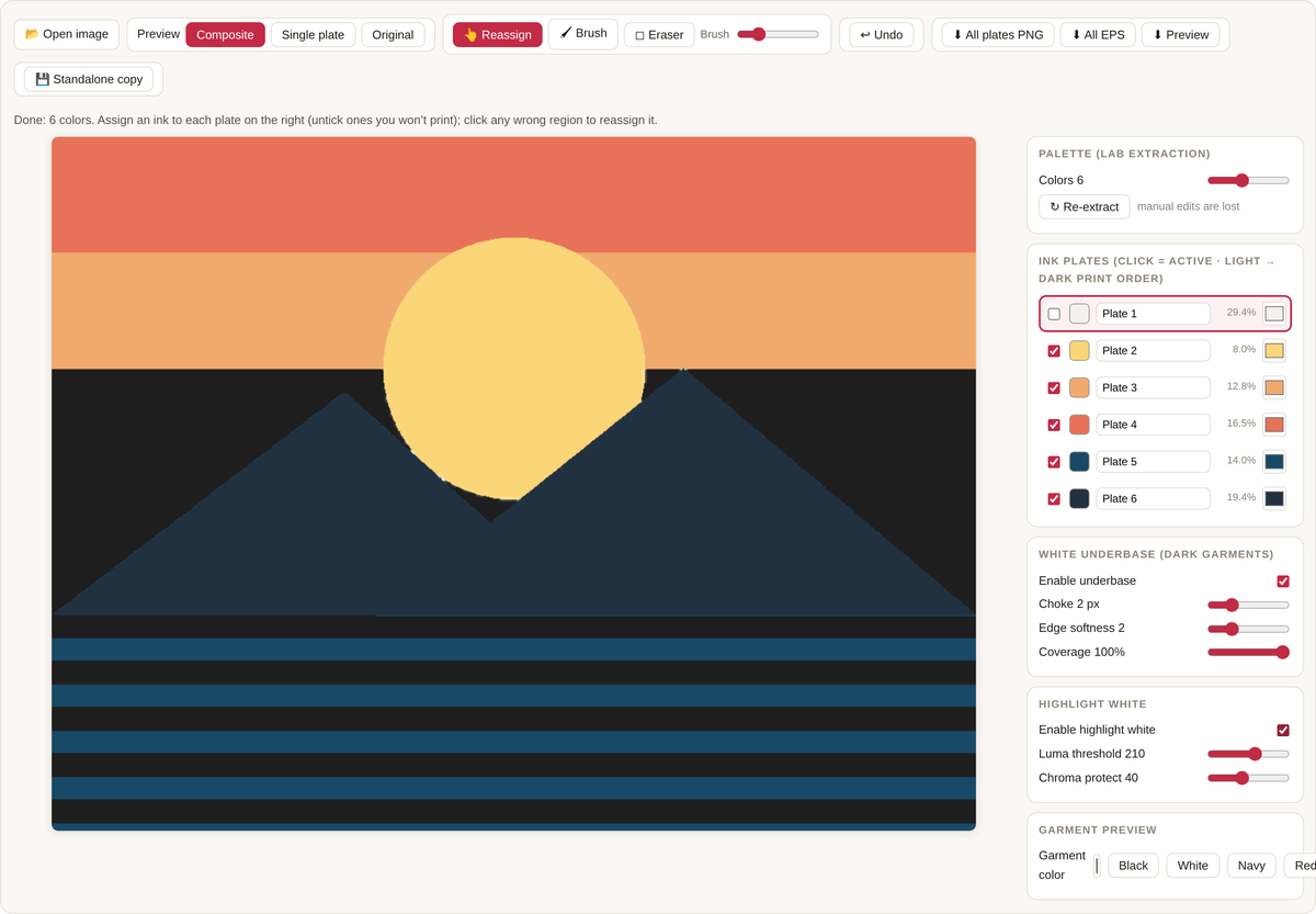
On dark garments, the brightest parts of a design often need help: the underbase white gets covered by color inks, so nothing in the final print is actually white anymore. The highlight white is a final white plate printed on top, hitting only the brightest, least-saturated pixels — clouds, glints, foam, teeth.
Two thresholds control it. Luma threshold sets how bright a pixel must be to qualify. Chroma protect keeps colorful bright pixels (a bright yellow sun, say) off the white plate — a pixel can be very bright and very colorful, and that yellow belongs to the yellow ink, not to white. Raise the protection and the highlight white retreats to genuinely neutral whites.
Step 5 — Export the films
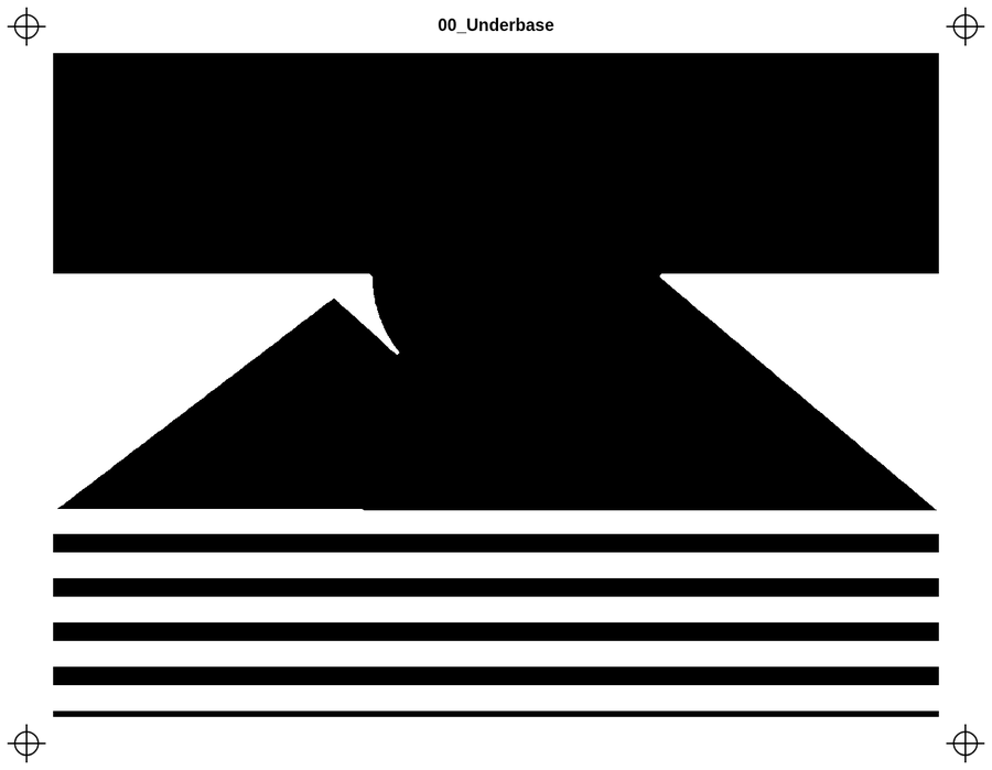
“All plates PNG” writes one film positive per plate: your coverage rendered as black on white, with registration marks in the four corners and the plate name stamped on top. Black = ink. This is the file you print onto transparency and burn a screen from. “All EPS” writes the same plates as 1-bit EPS for RIP workflows that expect PostScript. Both come out at the full processed resolution (up to 4000 px on the long edge), and any manual fixes you made with the reassign tool or brush are baked in.
One honest caveat: the EPS files are standards-shaped 1-bit PostScript and byte-verified against their coverage maps, but every RIP has its own opinions — open one in your RIP before committing a job to film.
Privacy, and where your files live
Everything in this tool runs in your browser: the clustering, the previews, the exports. Your artwork is never uploaded — there is no server to upload it to. (You can confirm by loading the page, pulling the network cable, and separating anyway.) The only thing stored is your settings — color count, underbase and threshold values — in this browser’s local storage, so the tool opens the way you left it. The standalone download is the same tool as a single file: double-click it on any computer, online or off.
The short version
- Open flat-color artwork; set the color count; re-extract if the palette looks wrong.
- Rename plates to your real inks, untick the background, fix strays by clicking them onto the right plate.
- Dark garment? Underbase on, 1–3 px choke, highlight white on.
- Preview on the shirt color. Export PNG films (or EPS), print to transparency, burn screens in list order.
Flat artwork in, press-ready plates out. That’s the whole job.